In a previous post, I looked at some of the ways we could visualise the input space of climate models, when they are constrained to produce behaviour that looks something like the real world. I used parallel co-ordinates plots and pairs plots to visualise the high (32) dimensional input space of the JULES land surface simulator, when forced by a global historical reanalysis.
The aim of the visualisations was to understand the relationship between the model inputs and outputs, and feed that information back to the modellers. The more they understand about how closely their model mimics the behaviour of the real world (and why), the easier it is to make it even better. If modellers understand how the model output changes as they alter the parameters, they are able to relate any differences between the model outputs and observations back to the processes in the model that use those parameters. Sometimes they even find that there are no values of parameters which bring the model output close to the observations, in which case there must be some underlying error or deficiency in the model.
The ensemble I used was nearly 500 members – pretty large by climate model standards, but quite small when it comes to understanding detailed and subtle relationships in 32 dimensions. 500 members get lost pretty quickly in such a large input space, even when the space of active parameters (i.e. those that have a significant impact on model behaviour) is often smaller.
A handy tool for these situations is an emulator.
An emulator is a statistical model that predicts the output of a complex and function (in our case, the climate model), given any values of the inputs. It is trained on a small set of examples of the input-output relationship – for example an ensemble of climate model runs. An emulator can be just about any kind of statistical or machine learning model, but I tend to use Gaussian process regression, specifically the DiceKriging package for R by Roustant et al (2012).
A Gaussian process emulator predicts untried inputs using a smooth mean function. It estimates the uncertainty of the prediction, with the uncertainty growing the further away from the known training points. In this example, a one-dimensional model produces output y at input x. The black line is the true output, but it’s so expensive that we can only afford to run it at 8 inputs. We get the red points, and fit the emulator, with the blue solid line representing the best estimate, and the dotted lines the uncertainty. That uncertainty shrinks to zero at points where we have run the model.

Gaussian process emulator in one dimension.
The emulator means that we can examine output y at just about any value of x. We take advantage of that for JULES, fitting 6 separate emulators to the model outputs of the global carbon cycle that we saw in the previous post. If we keep only those inputs where the estimated output lies within our constraints, we get a more detailed view of the input space that is “Not Ruled Out Yet” by those constraints.
Here, I’ve sampled uniformly from the hypercube defined by the original experiment design, and kept only those points which aren’t ruled out by the constraints. About 18% (18,000) of the emulated points are retained. There are too many to put in a pairs plot, but we can plot the density of retained points in a pairs() plot using a 2D kernel density estimator. The emulators are built using only those ensemble members that passed the “level 0” constraints from the previous post (i.e. does the model run, and produce runoff above zero?)
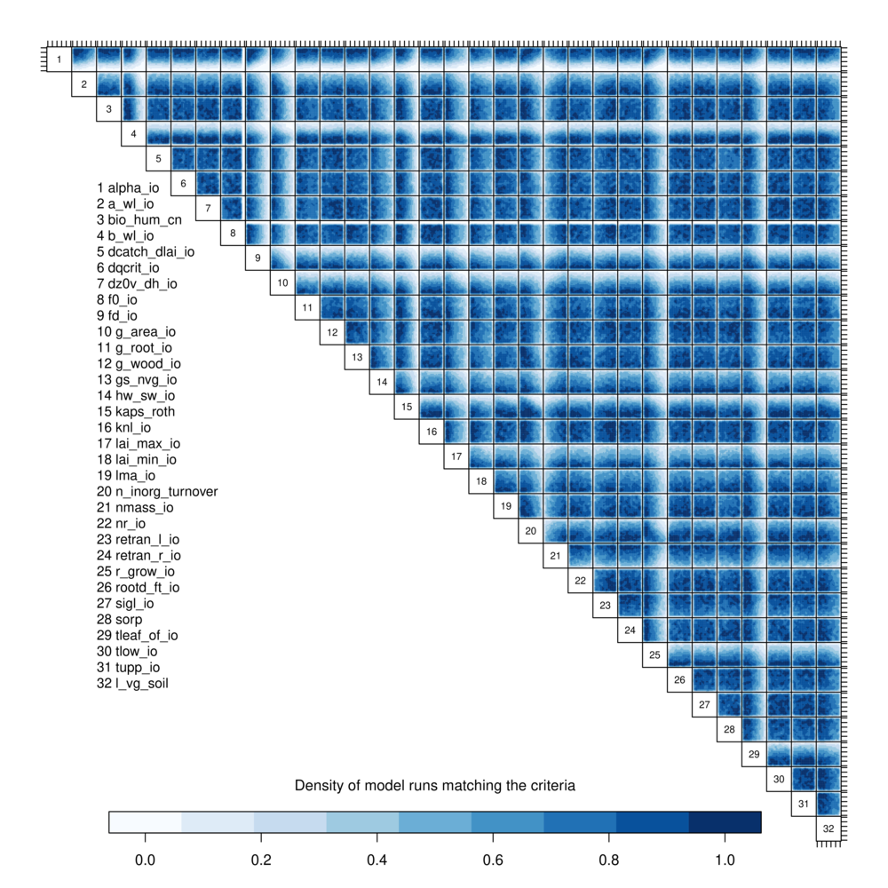
A pairs density ploy of the JULES inputs that pass level 1 constraints
White regions of parameter space are therefore two-dimensional projections of the places where the vast majority of candidate input parameter values have been ruled out.
There is more detail that the corresponding plots using just the ensemble members seen in the previous post – although, remember that the relationships between the inputs and outputs are just estimated here, so there is some uncertainty not accounted for. More parameters show up as having a constraining effect on the input: as well a 1 (alpha_io), 4 (b_wl_io), 25 (r_grow_io) that we identified in the raw ensemble, there is also a hard boundary at high values of 8 (f0_io), and constraints at 9 (fd_io), 10 (g_area_io), 15 (kaps_roth), 17 (lai_max_io), possibly 20 (n_inorg_turnover) and 21 (nmass_io), and certainly 29 (tleaf_of_io). Some of these features might be artefacts of the kernel density smoother (here R function kde2d), so it’s important to visualise the data set in several ways.
Here, I’ve use used the R package plot3D and function scatter3D() to visualise the input space of the three most important inputs – alpha_io, b_bwl_io and r_grow_io. I’m showing a subsection of 10,000 of the 18,000 input points that were retained after the level 1 constraint. The output here is coloured by Net Primary Production (NPP) as calculated by JULES – or at least estimated by the emulator. I could use any of the outputs to colour the points, but NPP shows some interesting structure. I generated 360 png images, each rotated by 1 degree, and stuck them into an animated gif using imagemagick convert.
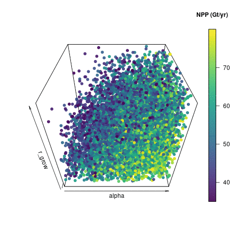
10000 emulated ensemble members that pass basic carbon cycle checks.
Visualising the input space in this way shows some useful features. You can see how noisy the output is – perturbations in those other parameters not included here are clearly also having an effect on NPP. You can however see that high values of alpha tend to produce a higher NPP. There is a useful lack of points in the “low alpha, high b_bwl, high r_grow” corner, which indicates that this would be a poor region to pick parameters to run the model, if we wanted it to look like reality.


